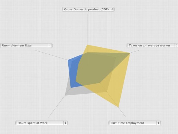
During our work this week, we stumbled upon The Country Comparator, a project “based on OECD data, created using HTML5 and Raphael JS.” OECD data? Raphael JS? HTML5? Be still our beating hearts.
The Country Comparator allows the user to compare OECD member countries according to three themes (health, society, work) and several indicators such as suicide rate, alcohol consumption, unemployment rate, fertility rate and life expectancy.
Reminiscent of World Shapin, the project is the latest from Anthony Veyssiere. He was one of the French brains behind ReTwith 2012, the interactive visualization of politician popularity on Twitter, winner of a prize at this year’s YouTube/Elections 2012 competition.
Public-Service.uk
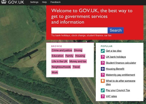
Across the Channel, the British are slowly constructing the future of public services. After being among the first to fully engage with the process of opening up public data, Her Majesty’s government have now opened a website (still in BETA for now) dedicated to public information and public service, simply entitled gov.uk.
The user can search by keyword, by means of a clear and simple to use interface, through content as diverse as the dates of school holidays, the steps to take in the case of the death of a relative or the amount of local taxes. Many procedures such as paying a fine or reporting a crime can be performed online.
Meanwhile, in France…
…the progress of open data is steady if painfully slow. Etalab, the government task force charged with opening up public data, launched data.gouv.fr last December. Now they’ve announced the opening of Dataconnexions, a “community of projects” aimed at promoting exchanges and creating a link between “offers” of service and “demands” for project leaders. Open to all “open data professionals” (journalists, students, freelancers, startups…), Dataconnexions promises four competitions in 2012 and four co-working get-togethers.
Another initiative of note, the Open Data School, is supported by two masters students, Rémy Lombard and Ludovic Péran. Their team – Data Team – won the Challenge Administrations 2020, which “asked students to imagine, in teams of two or three, projects to make life easier for citizens, families, associations, business leaders….in short, all users of public services”.
The Data Team project:
to educate and train public servants, the data producers, about open data in order to accelerate its development in France and improve its quality (…) through training, whether interactive, online or in a seminar.
Their motivation:
We believe this platform (data.gouv.fr) must include the citizen at the heart of its functioning, something which is not the case today. The site reflects the logic of the French open data project that is uniquely top-down when it should be bottom-up. (…)
We believe innovation does not consist of offering the citizen what he expects, but instead what he needs. That’s our motto for carrying out the project.
We couldn’t put it better ourselves.
Anatomy of an infographic
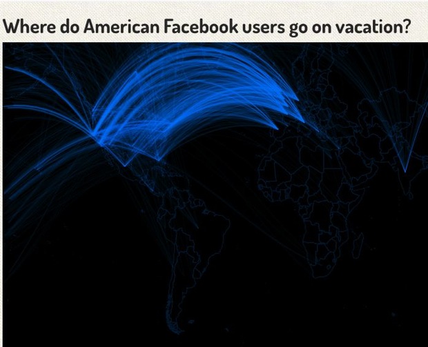
Pete Warden (formerly of Apple, creator of the OpenHeatMap) explains his latest visualization over at O’Reilly Radar, which allows the user to observe where Facebook users in the US go on vacation, as well as the top 10 cities from which visitors arrive to a given location.
While not revolutionary, this visualization does its job perfectly and provides some real information. Pete Warden discusses each stage of its creation (data recovery, cleaning tables, choosing the look, implementation, ..) in a lively and very didactic manner. You end up taking a course in dataviz without even realizing it.
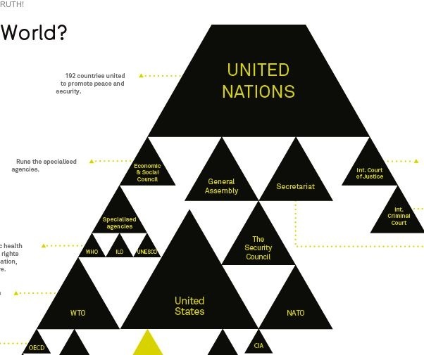
UN = Illuminati
A global conspiracy finally revealed by David McCandless. With Who Runs the World? he’s produced another very successful infographic: simple, visually pleasing, ergonomic and (most difficult of all) funny.
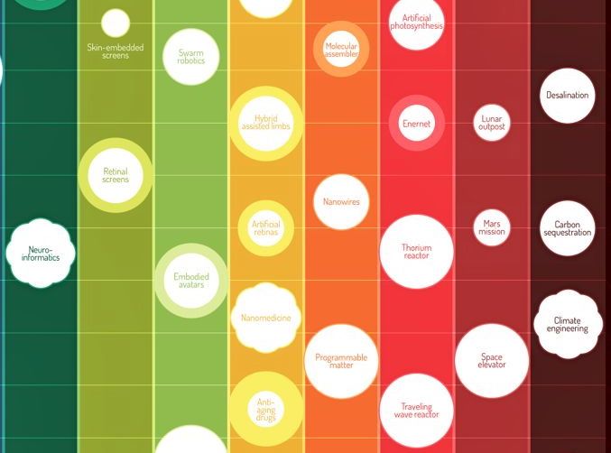
Our second infographic of the week is Envisioning Technology, created by Michell Zappa, which invites the user to dive into the future. But not just any future: for Michell Zappa, the future is serious business, and much “more than guesswork.”
His job as a technology strategy consultant is to observe and analyze emerging trends, and then draw conclusions on how the technological sphere will develop.
Envisioning Technology represents this research: a timeline from 2010 to 2040, an infographic divided into 11 bands of color, each representing a technological category such as artificial intelligence, robotics, the Internet, energy, biotechnology…
The various innovations are positioned in this frieze according to the year they’re supposed to appear, and are graded according to user impact, importance and technology crossover.
Knight Rider fans will be delighted to learn that cars like KITT (with automatic control) will be commonplace from 2018, and appeals for blood donation can stop from 2017 onward, when synthetic blood will make its appearance.
Alongside traditional robots and developments in technological machines, one can find more incredible ideas like the “utility fog”, arriving in 2039: a cloud of microscopic robots whose form and features change depending on demand.
Political Scan
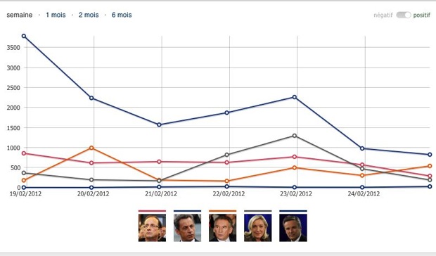
We’ll conclude this latest edition of The Week in Data with a short tour of the French political media scene. For the 2012 presidential campaign Le Figaro has launched Le Scan, a barometer of online opinion on the candidates.
Le Scan compiles several sources of data. For each item of web content, Le Scan’s semantic analysis engine attributes a positive or negative feeling, whose association allows the user to measure several classifications: the mood of the media, the mood on social networks, the volume of mentions, recruitment of fans (on Facebook and Twitter). To all this information is added the ability to see news of the personalities in the media and a ranking of their popularity.
All of which equals valuable content, which unfortunately is not highlighted by the ergonomics of the site. On the other hand, features within each classification are well designed, allowing the user to add or remove as many candidates as desired.
And if it’s French presidential rankings you want, take a look at this, it’s not too bad /-)
Have a great data-week everyone!
Follow OWNI’s elite data squadron on Twitter: @pdatha, @mariecoussin, @juliengoetz, @nicolaspatte & @gregoirenormand
